Sorry for the long waiting. Due to our limit of time, we have postponed the rebranding effort of yiiframework.com till now. Anyhow, in the past year, we still achieved something in rebranding. In this post, I will describe our latest progress. If you have any suggestions, please let us know. I believe we will see a very attractive yiiframework.com soon.
New Logo
We hired a professional logo designer and created a new logo. Please see the attachment. Hope you all like it!
744
zaccaria commented on this new design with following words, which I think well explains the meaning behind:
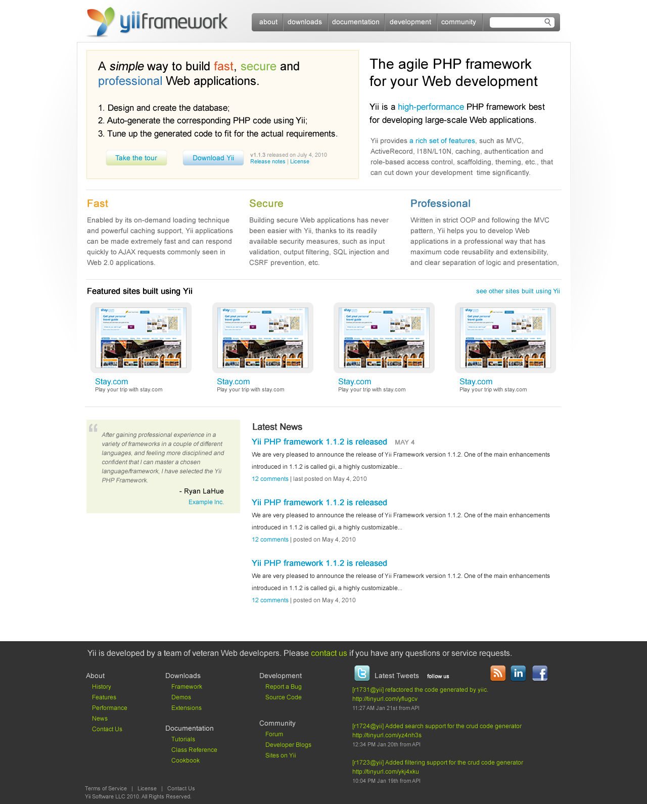
New page design
This is still a work in progress. Please see the attchments for our current design. We hope the design has a professional outlook while still maintaining good reading experience since we have so much to read in the site. Because our logo already contains many colors, we mainly choose gray/white colors for backgrounds.
We may need some nice little graphics to decorate the homepage. If you have any suggestions, please let us know.
We also need some nice quotes from you that will be placed on the homepage. If you like Yii and are willing to let us use your words, please send a PM to me with your quotes, name, title, company name and URL. Thank you very much!
We would appreciate if you could let us know your comments on the copywriting on the homepage. The goal of the homepage is to attract more new users.
745
746
New development
We are rewriting the whole application powering yiiframework.com, based on the feedback we have received so far. We will mainly improve the extension system, the documentation system, and the community system. We will reveal more details as we get there.
Logo - very beautiful, these four colors are used in well-known companies logos like Google, Microsoft, EBay, etc. Very good choice
Page Design - looks nice, soft and clean, very good!!!..maybe a little more of warm colors in some points, like in the main menu, the active page could be highlighted in some warm color from the logo
New Development - just can’t wait to see the changes and improvements in Yii website
Congratulations Qiang, Yii Team and collaborators!!
Great news, thanks for sharing! Both look very good, for my taste.
I really hope, this wont start another lengthy discussion about colors, so that it gets implemented soon. You’ll never reach 100% agreement. But this design should really satisfy everyones demand for a more professional look of Yii’s website.
I like the new logo… but new page design can be improved a little… the lastest news is positions a bit awkward… and the text is a little too black too much contrast would be nicer if make it a little softer.
Also the text color in the footer looks a little weird… and the forms on the inside page look a bit weird but maybe those are from some wire framing kit?
Logo is good but design/blocks layout looks far from being completed.
What I can see in front page template:
No links to extensions and API in menu.
About is not commonly viewed thing (and is actually 70% presented on the front page itself) so can be moved to the footer.
"Take the tour" / "Download Yii" buttons are not close enough to each other. Gradient top on them looks nearly the same as block background color.
Sitemap at the bottom is a good idea.
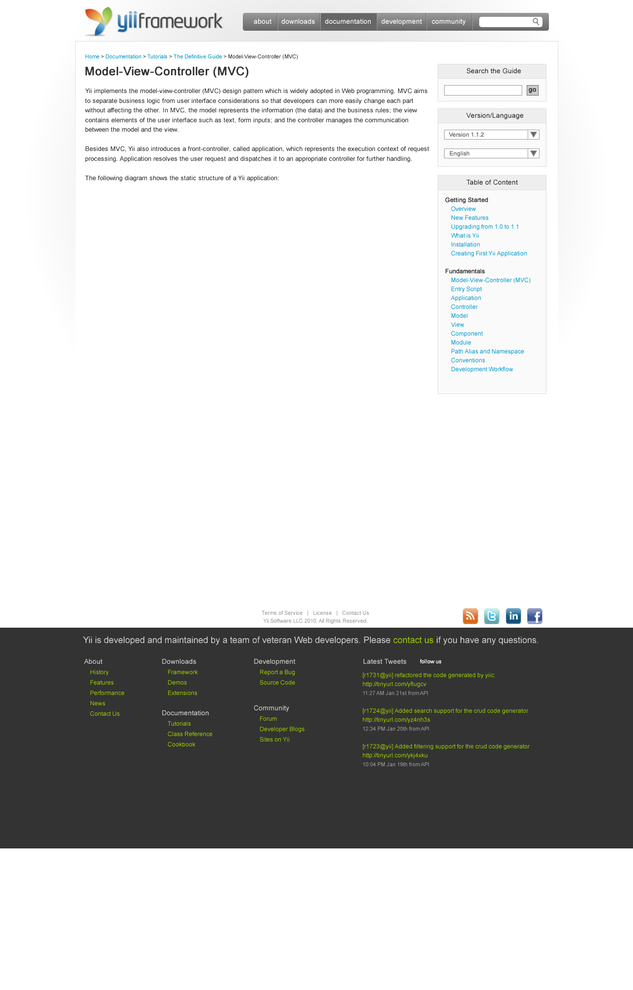
Docs template looks like the work is started but is not finished. Layout itself looks good (actually I choose the same one for Russian Yii community website).
Thank you for your comments. Here are the answers to some of the questions raised:
The logo is finalized. We will not make changes further.
The page design is not finalized yet. We will still make changes here and there (such as the button style as samdark suggested), but no major changes in the layout or color scheme
The homepage is mainly targeted at new users who may not be interested in any details like tutorials, extensions, or even news yet. That’s why the news are placed in the lower portion.
The mainmenu is a dropdown one, the structure of which is the same as the sitemap on the footer.
It was time to change the site… the logo is fantastic…
for the design and positioning of elements there will never be 100% agreement what should be where…
I too would like the extension the main menu… but as qiang sayed new users especial those that comes for the first time dont need that… but I would say that for them the development menu is even not interesting… but more on that the DEMO menu is very much interesting…
whenever I get to some new page about some extension/framework first I get to see the demo… and if the demo is pleasant and nice for me… than I investigate further… if not I go away… so IMO the demo menu should be in the main menu on the top… and special care should be taken to make some nice and usefull demo samples…
It was an idea to distinguish it from the Microsoft logos. Really, I’m trying to persuade myself that it differs from the MSN logo… but I can’t. The first time I saw it, I thought it was a Microsoft logo, it’s too similar, definitely. Maybe “this four colors don’t belongs to anyone” (same order than the Windows logo?), but Microsoft used them before. I fear Yii will be “the framework with the logo copied from MSN”, not a very professional reputation. And the shadow is just ugly. My 2 cents.
I think Yii is moving into the right direction with the new website + logo. It looks more professional than the current design. Though some details could be improved like already noted (logo needs no change imo).
Qiang, will you make the new website-source public? I think for newcomers it could be a good learning source. Maybe you could create an own google-project for it?
I think if we’ll change red and green petals to blue color, logo won’t become less professional (maybe otherwise), but no one will say it looks like MSN logo. Btw, in the last version of Visual Studio Microsoft uses only blue color in logo and it looks pretty nice
Of course, it is just my humble opinion, but I find blue & gray enough for Yii style.